Illustrating Jane Austen: The Artist's Challenge
"These are done by [Elinor]," said he; "and you, as a man of taste, will, I dare say, be pleased with them. I do not know whether you ever happened to see any of her performances before, but she is in general reckoned to draw extremely well." -Sense and Sensibility
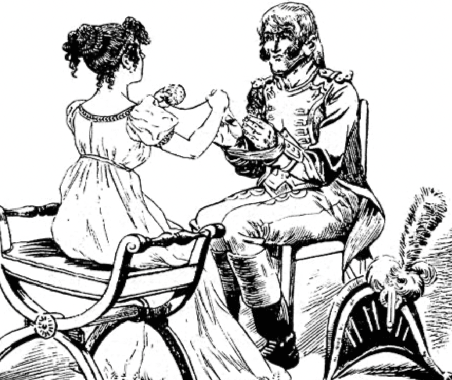
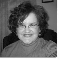
Several years ago, Cassandra Chouinard worked with the Jane Austen Centre, to illustrate our comissioned novella, There Must be Murder, by Margaret C. Sullivan. Her charming illustrations brought Jane Austen (and Ms. Sullivan's) characters to life and we were delighted when we heard that she had again illustrated an Austen novel-- this time, Sense and Sensibility, for the online publisher, Girlebooks. Here, she tells us about the challenges she faced as she brought this novel to life.
Cassi, please tell us about your background in art.
I must have started drawing once I developed the manual dexterity required for holding a crayon instead of eating it because I don’t remember a time when I wasn’t drawing. After many childhood years of appallingly crude and nonsensical scribblerish, I thought about becoming an artist (and not a cowgirl). In high school, I practiced painting in oils with the guidance of my art teacher, Daphne Dain, and then I explored other media while not completing a degree in Fine Arts. Mainly I’ve drawn a bunch of cartoons and portraits and animals.
Tell us about your background with drawing Jane Austen-related scenes. When did you first read Jane Austen? When did you first start drawing Austen-inspired art? Do you ever draw Jane Austen-inspired work for fun?
I used to draw a LOT of period subject matter, particularly clothing, but not just Regency. I went through a deep Medieval/Renaissance obsession in my earlier teens, and then I immersed myself in the Victorian Era and touched the Regency Era, and then I doodled more of the latter while meandering through the 17th and 18th centuries for several years. I also sewed and did some costuming; I still have a yellow Empire dress I’d made.
About this time, I was drawing a little portrait series of famous people, including Jane Austen…I guess I was nineteen or twenty when I first drew her. I’d first read her books a few years earlier while I was in high school; unfortunately I don’t remember which novel I read first, nor if it was a required reading or just something I’d picked up randomly, but I liked it and I skimmed through a few other Austen novels, including Sense and Sensibility. I was an especially fast and careless reader as an adolescent mainly because I had to know asap if the heroine got her guy. And, truth be told, I remember thinking then that Marianne was so amazing and there wasn’t too much wrong with Willoughby except that he was kind of bland and wishy-washy—I guess I’d completely skipped over the part about Eliza! Actually, I found the whole book kind of bland then: my favourite was P&P even before the mini series with Colin Firth came out. I loved Austen’s dialogue but those poor Dashwood girls did a lot of waiting around.
However, a lot of the humour was lost on me then and it was very interesting to finally notice it while rereading the novel umpteen years later. It was like a completely different book! I’d also initially failed to consider the horror of sitting in a room for hours at a time trying to make conversation with the same disagreeable people day in and day out.
What do you like and dislike about Sense and Sensibility?
I like the wit, and I dislike the relative paucity of breech-ripping derring-do action but only because I sometimes found it difficult to find exciting stuff to illustrate. There is a lot going on in that book, many undercurrents of drama and satire. 
How did you decide which scenes of Sense and Sensibility to illustrate? Is there anything about the novel that makes it easier or harder to illustrate?
To expand upon the previous answer: there are great subtleties to be observed among people conversing but I could have conveyed this better. I’ve been thinking of how my illustrations could have been improved and I’ve decided that more close-ups would have been appropriate. I drew what interested me. I was a coward though because there were a few drawings that I wanted to draw but just couldn’t manage for whatever reason. Either I couldn’t picture them, or I struggled with the composition and lost, or I felt that I couldn’t match the tone of the book. And, by the end, I was just plain lazy. There should have been a parting illustration of Elinor and Edward. That’s the big one that got away. 
My main goals were to portray the confinement of Society juxtaposed with the expansiveness of the outdoor walks Marianne enjoyed, and to depict the waning of Marianne’s appearance. For some reason, this fascinated me. Elinor in many cases is the true heroine of the book but it is Marianne who changes most visibly. Although, come to think of it, if I had drawn more detailed portraits, I could have depicted Elinor growing ever so slightly more anxious. That would have been superb and I’m sorry I didn’t think of it at the time. At any rate, I took great delight in extending Jane’s more cutting characterizations: the elder Miss Steele = vapid, Lucy Steele = rodent-like cunning, Robert Ferrars = ridiculous, and so on.
What inspired you visually for the illustrations? For instance, did you have a particular film adaptation or actor in mind at any point?
It had been a while since I’d seen Emma Thompson’s film adaptation and I decided to stay away from that, as well as previous illustrations as much as possible in order to thwart my quasi-plagiaristic sponge-like tendencies. I tend to remember stuff I’ve seen and then forget that I’d seen it and not imagined it. This can be very embarrassing. Instead, I tried to glean as much as I could from the book itself and incubate my own vision of each character accordingly. Admittedly, I have no doubt that some of the faces in the book were from anonymous people I’d seen in public. I try not to stare at strangers, but it happens and so I’ve invested in some mirrored sunglasses. Maybe one day many years ago, I was on a bus or subway or wherever watching an old woman with a pinched face scowling at some noisy child, and now she is Mrs. Ferrars. 
Your "portrait" of Jane Austen is striking. What was your thought process behind the portrait?
I think that her sister’s portrait gives a surprisingly lot of information. It’s not the most polished work, but it strikes me as being a compilation of spending many years with Jane, thousands upon thousands of conversations and shared moments rolled onto a piece of paper. I sat and stared at it for ages, then I let it roll around in my mind for eons, then I drew what came out. It was rather rough and I ended up having to do a lot of digital editing to make it presentable, although I feel that some of the raw energy was lost in this stage.
I used to draw a lot of portraits—for a couple of summers, I had a stall in an outdoor market and drew anybody who sat and paid, as well as plenty of people who didn’t--and out of hundreds (thousands?) of people I’ve drawn, there were a few people that I just couldn’t draw. Their appearance depended more on their character and animation than actual bone structure and, in a few cases, I knew the person too well to step back and see their physical appearance clearly. Cassandra’s portrait reminded me of that. I imagine Jane Austen as this smallish fine-boned keen-eyed woman who had a very distinct expression at times (particularly when she was amused by something that very few others even noticed), but who was otherwise almost nondescript. Unless you exchanged a glance with her, you would take a long time to notice her in an assembly.


Leave a comment
This site is protected by hCaptcha and the hCaptcha Privacy Policy and Terms of Service apply.